I can't stand the deceptive design of Apple Music on macOS.
-
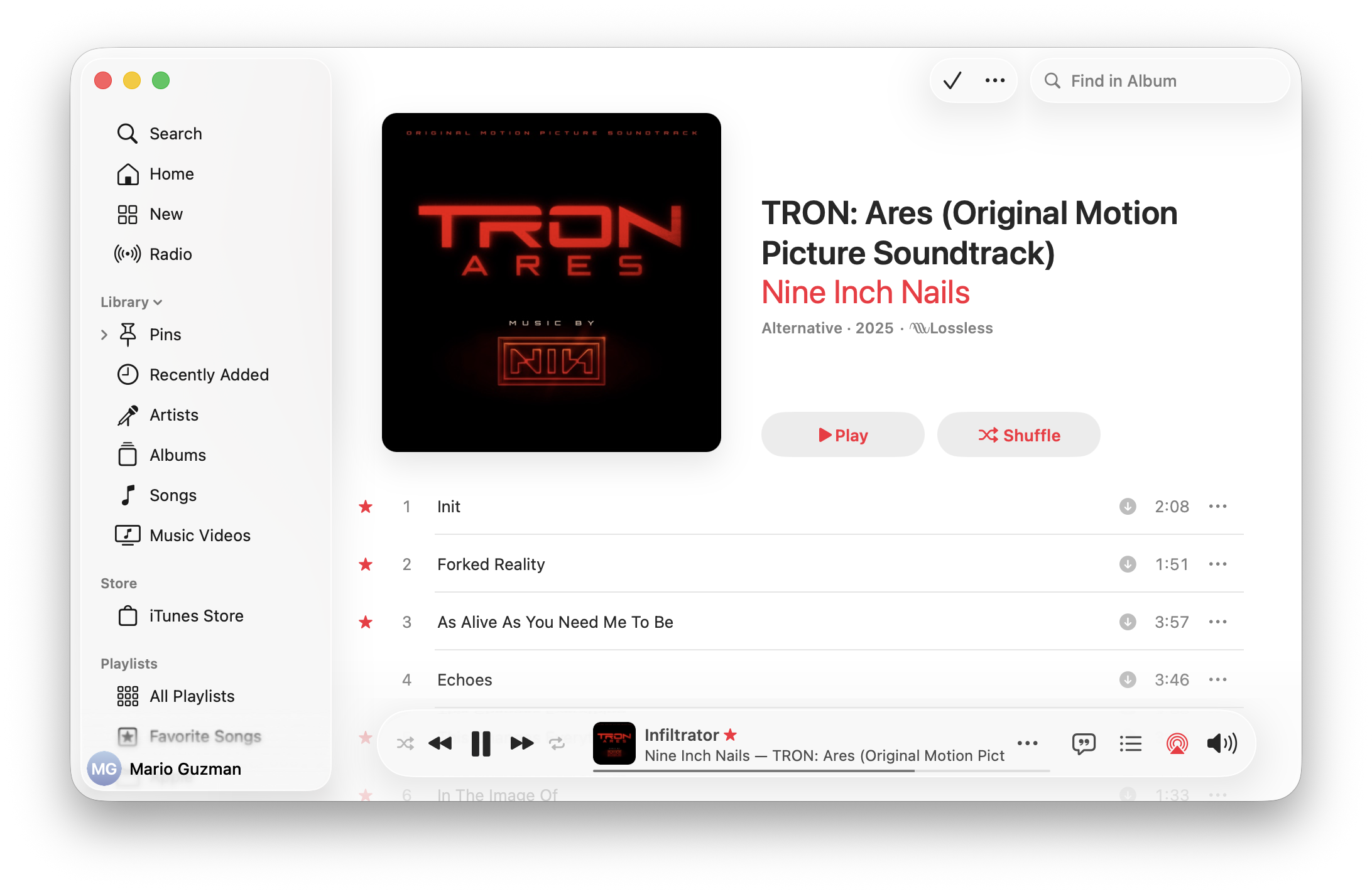
I can't stand the deceptive design of Apple Music on macOS.
When you hover over the track scrubber, it will expand making you think you need to have it in the expanded state to use it.
Save for the Volume.
For either of these, you can click and drag immediately to change their values.
But this is such deceptive design. They make you think you first need to expand (hover for scrubber/click for volume) before you can use them.
Why is this so bad?
It also gets all lost in a sea of white!
-
 V volpeon@icy.wyvern.rip shared this topic